There was a post published on WP Tavern this morning about the difficulty of the simple task of placing a left or right aligned image in Gutenberg—something that seems trivial in the classic editor.
I’m not trying to pick on Jeff for writing this post, but more wanted to address what seems like a common trend in complaints about the new editor. That the equivalent process in the classic editor was faster and required fewer steps. I think in most cases this isn’t true.
Comparing The Process
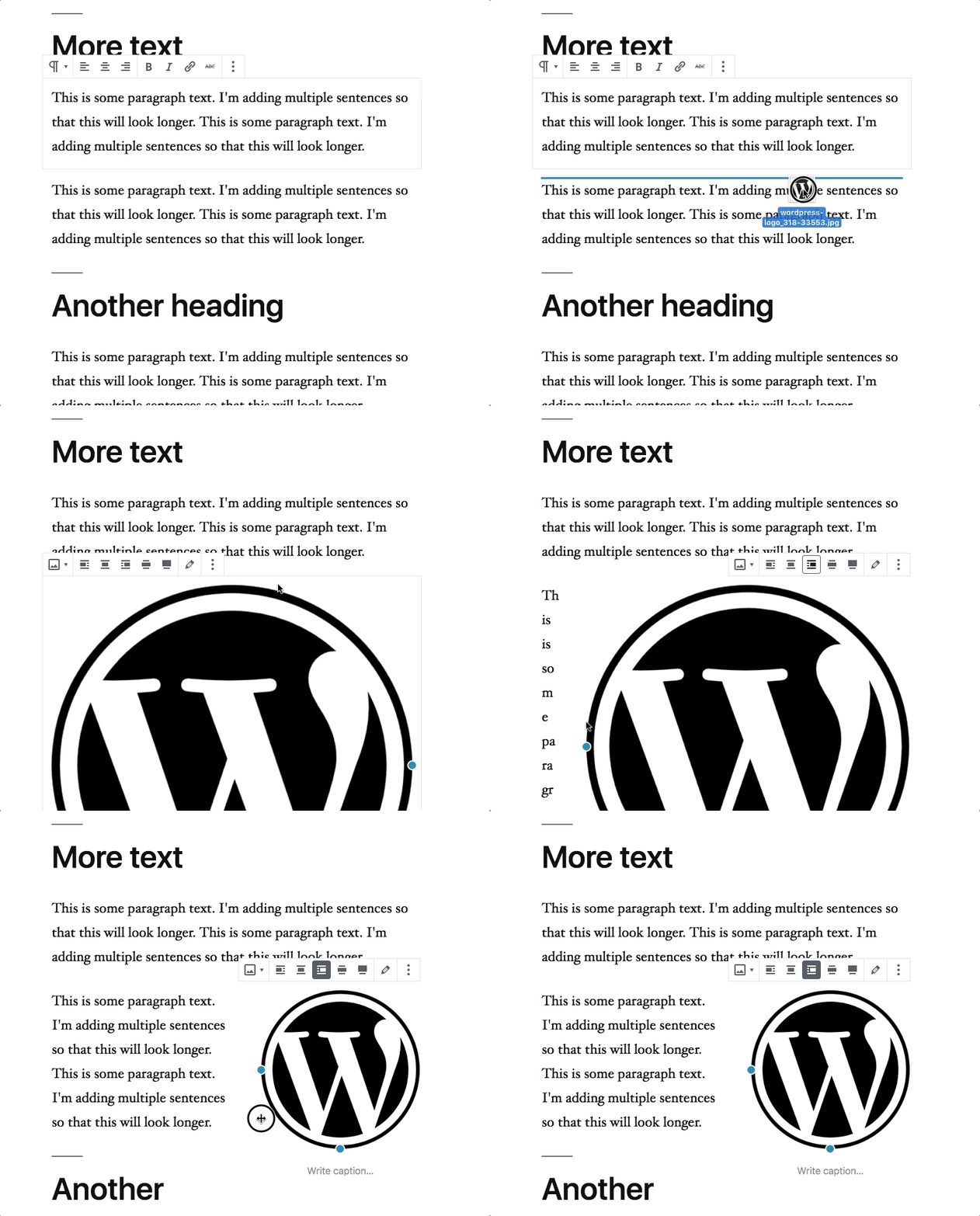
In the case of inserting a left or right aligned image, there are a dozen different ways to do it in Gutenberg. One of which is what Jeff highlighted in the post—adding it to the end and then moving the blocks around—but there are simpler methods.
The easiest involves just 2 steps:
- Drag an image into editor where you want it to go.
- Click align right.

Classic Comparison
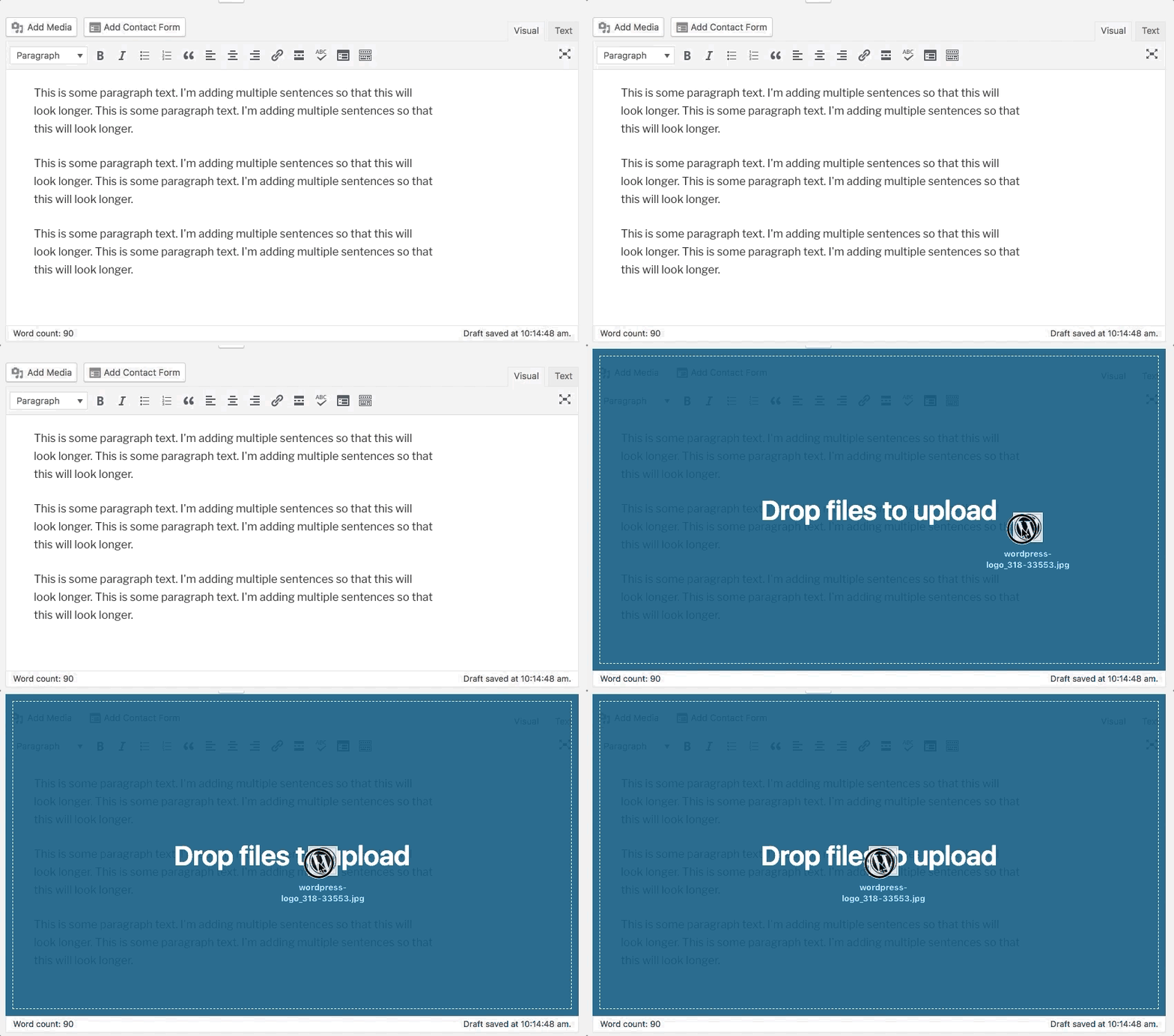
You can drag images directly onto the classic editor too, but it involves more steps:
- Place the cursor where you want it.
- Drag the image onto the editor.
- Click Select Image.
- Click on the image you just inserted.
- Click Align right.
The entire editor is the drop zone for dragging, so you can’t drag it straight to where you want. You either need to place your cursor in the location you want it to end up, or drop it and then move it later once it is placed.

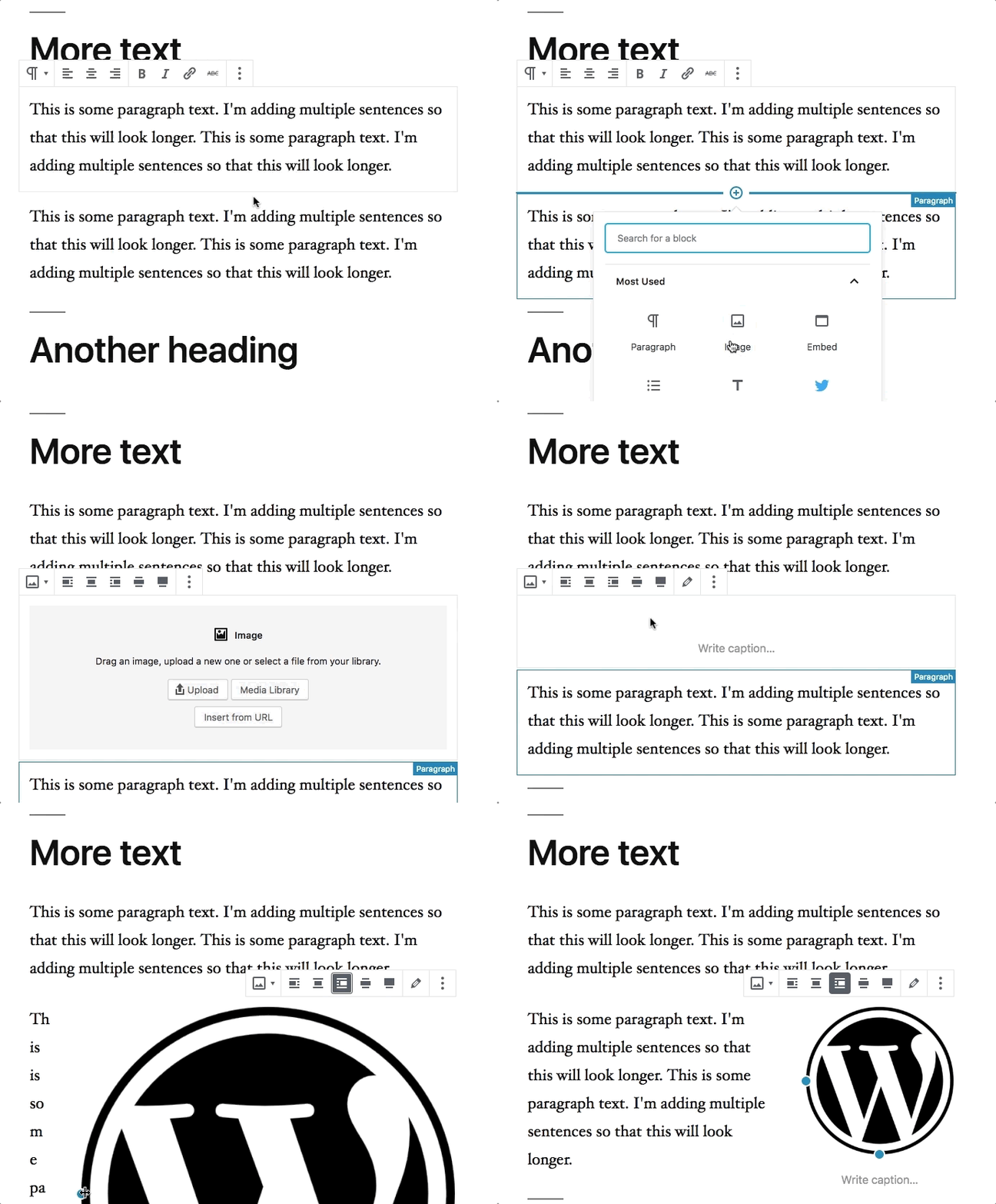
If you prefer to click specifically where you want the image to go, a similar method in Gutenberg actually requires one fewer step:
- Click the block inserter above the paragraph you want to insert the image before.
- Select the image block.
- Drag the image onto the block.
- Click align right.

These examples both use new images being inserted, but let’s say the image is already uploaded and you just need to select from the library.
It turns out it’s the exact same number of steps in both the classic editor and Gutenberg—both involve 6 clicks.
There are even more methods beyond these. Global block inserter, keyboard shortcuts, etc. None of them are particularly complex once you’re aware of them, but some are a little less obvious (like keyboard shortcuts) until you’ve learned how to do it once.
All New Interfaces Require Training
I’ve trained a lot of non-technical people on WordPress through the years and the first time they encountered the classic editor they had to learn what the various controls were and how they worked—especially if you have plugins adding things to it. The method from the classic editor feels intuitive now because there are years of training in using that method.
It’s important to keep in mind that this is a new interface and there will be a learning phase. And that’s perfectly ok.
The Complexity Argument
I won’t argue that Gutenberg isn’t more complex than the classic editor when viewed at the macro level. It is! But that’s because it can do so much more. It’s the first step in setting up for the long term goal of the project, which will simplify overall site creation and management.
But on a micro-level, many similar actions being done with the classic editor actually require the same or more steps than Gutenberg. It just doesn’t necessarily feel that way because we’re so familiar with doing it the old way.
Many of the WordPress workflows we know by heart are changing, but I feel it’s a pretty easy argument to make that dragging the image directly to where you want it is actually more intuitive to someone experiencing WordPress for the first time.
Now do it without mouse.
That wasn’t the point made in Jeff’s post, but since you brought it up, I tested it out. You’ll probably be disappointed to hear it takes fewer keystrokes.
That’s not to say there aren’t a bunch of things that could be difficult to navigate via keyboard, or that it could be overwhelming the first time you use it.
My point is that many people are making assumptions about Gutenberg requiring more steps/clicks to do the equivalent thing in the classic editor, and that isn’t typically the case if you actually compare the workflows.
The main exception I can think of is publishing, which requires 2 clicks instead of 1. But I also disagreed with that choice.
Appreciate you sharing the different options for inserting the image. As we want users to learn how to use the Gutenberg editor, can you point me to the Gutenberg documentation describing the different options? I’d like to share it with our meetup groups. Thanks!
You bring up great point in this conversation…I’m not sure that documentation exists yet! That’s definitely a problem.
The current handbook gives some good overviews of design principles, terminology, and developer targeted docs, but is very lacking in general how-tos.
That said, there are big efforts on the documentation front right now heading toward release date. It’s an area where we could use assistance from people looking for ways to contribute to WordPress.
Thanks for the quick reply. Lack of user documentation is an issue. Without documentation, many users will not have any idea how to use the new interface.
And that’s a lot of frustration, multiplied many times by users going through similar frustration Jeff documented in his post. And he’s a very experienced WordPress user trying to use only one feature in the new editor.
From my own past release experience (not WordPress), with a little over two weeks to go for final release, I can’t imagine how user documentation will be ready.
Hi Deborah, you’re likely right. As I’m sure you’re aware, the WordPress project is run by volunteers.
It would be awesome if you could reach out to your local community and urge them to contribute to the core documentation team. Here are some instructions – https://make.wordpress.org/docs/
How large was/is your user base?
What do you mean?
Hey Will, great write up! The pre-Gutenberg climate is certainly a bit…divisive…but pieces like these that aim to explain the process are awesome!
What provision will be made for those of us who are blind, using screen reader technology, and who do not have the ability to use drag and drop? Is it anticipated that a third party workaround will be required or are there plans to resolve the underlying accessibility issue?
Drag and drop is not required, it was just my example here for the purposes of direct comparison to the Tavern post. It was actually fewer keystrokes in Gutenberg than the classic editor when I tested adding an image using keyboard only. I should probably document that out too.
Don’t get me wrong, there is definitely work to be done on the accessibility front, as well as better surfacing of efficient workflows for new users.
“All New Interfaces Require Training” <—— this is exactly a large part of the issue. Most of our client base has no interest in having to learn something new when what they have is already working for them. Even from a development perspective, for those of us with small agencies with limited manpower – having to learn a whole different way of coding to meet requirements for advanced websites to integrate with Gutenberg is an expense that is not one we can spare both in time and money. While I do see how Gutenberg can be a useful too – I still stand strong it should remain a plugin and an OPTION and not forced on everyone.
Those clients can stay on 4.9.X forever and don’t have to update to 5.0. Or you can install the classic editor plugin and delay the transition indefinitely.
Core officially supports only the latest branch. While they will try to back-port security fixes to previous versions, there is no guarantee they will: https://codex.wordpress.org/Supported_Versions
The only way to _ensure_ you are going to get security updates is to stay up-to-date with the current branch. Therefore, staying on 4.9.X forever is not a valid option. PLEASE don’t suggest not updating is a viable option to not using gutenberg.
I would *love* to see core offer a LTS version of the 4.9.X branch, but i highly doubt they’ll do that.
No, the only real option is to update to 5.0 and install the classic editor plugin and **pray** that core doesn’t force Gutenberg into every nook and cranny of WordPress before they’ve fixed all of the accessibility issues.
I know what the handbook says about supported versions, but we have been continually back-porting security fixes to all branches since 3.7, where automatic-updates were first introduced. That branch is 5 years old at this point, yet it just got an update back in July. There have been no discussions, nor indications of discontinuing that practice.
If you are seriously concerned about WordPress discontinuing the ongoing practice of de facto LTS for branches going back to v3.7, then you could stay on 4.9.X until the day it DIDN’T get a security update that other branches received. The bigger problem you’d likely encounter is plugins, which tend to bump their minimum required versions more quickly to make use of new functions and features.
Don’t like your chances Paul. The latest release of the Classic Editor has been nobbled with the note “Removed some functionality that now exists in Gutenberg.”
Is this the plan? Keep nobbling the Classic Editor until we have to use Gutenberg?
That’s just a poor description in the changelog. Look through the full diff…no classic editor features removed.
What was removed was some filters that Gutenberg required that are now part of core, or were resolved in other ways. They needed to be unset in the classic editor plugin before, but no longer need to be unset because they no longer exist.
Paul and Chris, here is your answer. You can feel confident using the Classic Editor plugin for the next 3 years.
https://make.wordpress.org/core/2018/11/07/classic-editor-plugin-support-window/
My wife installed the Gutenberg beta last night and I’ve been watching her early reactions. She actually ran into the problem of “how do I add an image in Gutenberg” last night and had to Google an answer. She’s been using WordPress for years, so it’s possible her issue was more about the process being different.
Regardless of how different the steps may be compared to the old WYSIWYG, if someone has to google a basic question about adding an image, I think there may be an issue.
Now that she knows at least one way to do it, is it easier/harder/same as the classic editor?
I had to google that as well, looking for how to do this within gutenberg documentation just is/was not available. Once I did this, you realize that gutenberg works on blocks and everything is a block, including images. The image block is not a nested block within a paragraph block (which is how we have always done it with HTML before (in wordpress or not), but rather a separate block in itself. The float works the same and shows your image as you want it. It does take some getting used to using the gutenberg tools.
There is nothing like wasting my time working out how to use the gutenberg editor, when I could just be doing what I want and write my blog. But hey you obviously have lots of time to mock the ones who don’t. I mean according to you it is just so simple and the problem is with the user.
Thanks for your comment. I’m sorry that’s the takeaway you got from this post. I wasn’t mocking anyone, but instead simply commenting on the oft-repeated misconception that things take longer or more steps in the new editor.
William I just wrote two paragraphs, both of them were in separate blocks. I wanted to delete them both at the same time as I no longer wanted the content. I highlighted the word content in both of the blocks and pushed delete. Both of the blocks remained, the select and delete function didn’t work. After much fiddling I eventually found a way. This required me to click on each block on the left-hand side and then delete each block one at a time. When all I want to do is type and edit, having to deal with a new more ‘simplified’ interface may seem okay in concept, but in reality is frustrating. Especially when you are having to learn as well as stay in the flow of what your thinking/writing. Perhaps the reason why people are saying it is taking longer is simply because of the steep learning curve and the complexity involved in having to use it. What may seem a misconception to you is a real struggle to them.
That sounds like a bug! Deleting as you described should work. I’m sorry it’s been difficult. Can you tell me what version of Gutenberg you are using and what version of WordPress you are on? Also what browser. I’d love to try to get that fixed.
I don’t dispute a learning phase, especially for those who have come from extensive experience with the classic editor. It’s not easy to change our long-used workflows. But I do believe that once someone is familiar with it (and we’ve cleaned up some of the rough edges like the bug you described), it will be a joy to use.
William I am not tech savy so I just use the wordpress.com not the .org. I use Chrome as my browser and as for the version of Gutenberg I only recently changed over to it in the last week. I am sorry I can’t give you more information.
I am believing that I will adjust to the change, but in the meantime it is a learning curve.